
Monday, 23 December 2013
Front Cover Draft 2
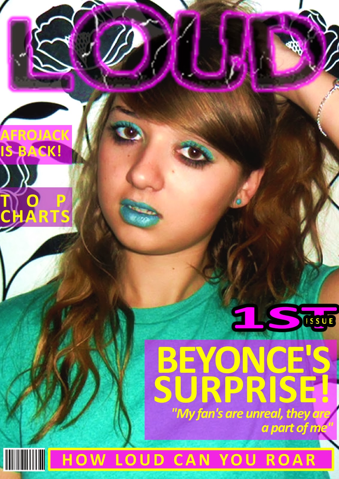
Again I used fireworks for my front cover. The changes I have made due to draft cover 1 is that the image is a mid shot and not a close up therefore the text fit more appropriately on the page. My front cover is still image dominated and the model is still making eye contact therefore engaging the audience. The house style colours have changed due to my masthead but are kept the same throughout and are vibrant, fun and loud. The other thing I have also improved are the cover lines being equally spaced out and rounded giving it a stylish look, some words are also in bold for emphasis which makes my magazine look more professional. I feel that this image is not as dominated as needed to be and the cover lines are all the same with not much emphasis on the artists name which is what attracts the audience.

Friday, 20 December 2013
Front Cover Draft 1
To create my music magazine I am using fireworks. In fireworks you can edit images, add text and pictures create new designs, add effects and be creative which is all very simple. This is my first draft, it is image dominated like my inspiration Dazed and Confused but also has a fair few cover lines to add extra information. The bright colours make it vibrant and fun and suitable for my target audience which are females aged 16-27. The model is directly looking at the camera to engage the audience. The mise-en-scene is planned so everything matches and goes with the house style of bright colours. The cover lines are based on my questionnaire and what artists they voted for. the negatives of this front cover is that there is too many house style colours. The background colours behind the head line and cover lines are squared which does not look professional. Additionally, this photo does not have a price or an issue date. The font which is used does not fit the connotations of being fun, loud and youthful, I feel that it is boring and uninteresting.
Editing Photo's
The second website I have used to edit my photo's is picmonkey.com. This example effect is HDR which makes the intensity either higher or lower making the photo more vibrant. These levels can be changed and varied to how you prefer the photo to look and what effect you want it to give.

Wednesday, 18 December 2013
Draft front cover 1 progress
For my first draft front cover I have chosen pink, yellow and green to be my housestyle as those colours fit with my genre and masthead of 'LOUD'. The image I have chosen is a close up and the subject is making eye contact which engages with the reader. The bold masthead going across the whole page really catches the eye. These images show that I am experimenting and planning where to put the pug, barcode and banner.

Monday, 16 December 2013
Photo Evaluation
Here are a few photos that I feel turned out the best from my first photo shoot. Some of these images have been edited slightly by changing the contrast and brightness or using the black and white effect. I have learnt many things during my first photo shoot such as lighting, quality and the effect costume gives therefore in my next photo shoot I will use a better quality camera and involve more people to hold torches to give a better lighting effect. All these photo's were took in my bedroom so maybe a new surrounding such as outside will show a variety of planning and give an unique effect which fits with my magazine genre being fun, youthful and loud.


Tuesday, 10 December 2013
flickr
On my flikr account there are my photo's I have taken so far, all of which are unedited. Some of these photo's did not go as expected and will be updated gradually with edits and more photo shoots.

Monday, 9 December 2013
Mise-en-scene Moodboard
For my photos I have considered what I want the subject to look like and if there will be any props. The props I have decided are headphones and sunglasses. The headphones give my magazine a more music feel and the sunglasses give a fun youthful look. I have decided a more casual look and also a sophisticated one, these consists of beanies, shirts, dresses and heels.

Editing Tools
One website I have used to edit my photo's is fotoflexer.com
The tools that I am going to use are:

Adjusting and contrast which affect the lighting of my images.

I have used rotating and flipping for when I have duplicated my images.

With my closeups I have used Fix red eye and when cropping objects out of the image that are not the main focus.

I have used these tools when filling or erasing things out. Such as making the background the same colour and drawing in any mistakes.


These helps skin look clear and makes it look like a better quality picture.
Saturday, 7 December 2013
Front Cover
Overall I would like my front cover to be mimilastic as possible. The image will have a plain background with the subject engaging the audience with eye contact. The masthead will be placed in the top left hand corner as this will be the first thing the audience look at, my masthead will also be very recognizable because of it's bright colours. As my front cover is going to be mimilastic there is not going to be much text on the page. I am going to have one main headline which matches one colour of the masthead with very few cover lines accompanying it. My front cover is going to be very colourful and vibrant attracting mostly females from the age range 16-24 who like pop music. The message my front cover is going to portray is happiness and creativity. My magazine will produce powerful feelings along with the strong realistic female dominant images.
Thursday, 5 December 2013
Rule Of Thirds
The rule of thirds is breaking down an image into nine equal parts by two
equally-spaced horizontal lines and two equally-spaced vertical lines.

This now
gives you important guidelines for your photo. The theory is that if your
subject is in the middle of the gridlines then the image will be unbalanced. Therefore
point of interest should be along the
gridlines because research has shown that the eyes do not look straight to the centre
of a picture. Using the Rule of Thirds comes naturally to some photographers.

Wednesday, 4 December 2013
Front Cover Photo Planning Table
This table shows my thoughts and different varieties of how I would like my front cover's image to be like. Each option is different including different costumes, makeup and colour scheme. I have chosen a range as eventually I am going to have to chose which I prefer and which colours and shots give the most effect. All images will have a mimiliastic background helping the subject stand out, this is because I want my audience to be engaged. My photos will be of single people as I feel group photographs make the audience feel less important and disconnected with the artists. I am going to take a range of photos as it will be difficult to find one that fits the layout, colour scheme and masthead perfectly.

Tuesday, 3 December 2013
Mood Board
This is my mood board. My mood board shows what I would like my magazine to contain and what I think my readers should be interested in. I have chosen four artists which consist of Ed Sheeran, Beyonce and Wiz Khalifa and Rihanna. I feel that even though all these artists are in the pop genre, they have different ranges of popularity. I have included YouTube, iTunes, Ministry of Sound and MTV as without these there would be no way of listening to music. Instagram and Twitter and H&M are also types of media which promote artists.

Monday, 2 December 2013
My Inspiration
I would like my music magazine 'LOUD' to be very mimilastic. My inspiration for my music magazine is dazed and confused. This magazine is based in London. Dazed and confused is read in print and online by 500,000 style leaders. It is very influential and successful. Most Dazed and confused front covers are a close up of a subject with creative makeup and costumes. Each magazine consists of a masthead which stands out from everything else. Dazed and confused magaine is mostly focused on fashion therefore does not need as many cover lines. The front cover shows creativity, youth and is unique. The high quality photo's and well organised layout show a professional and successful magazine.

Photoshoot considerations
When planning a photo for my front cover/contents page I need to consider certain things to make sure my photos look professional. These things are:
Makeup
Costumes
Backdrop
Lighting
Props
Hair
Camera Angles and Shots
Body Language
Positioning of subject
Facial expressions
Colours
Representation
single or a group shot
Editing effect
Masthead Ideas
In fireworks I have experimented my different masthead ideas. I have decided from my questionnaire results that I want my music magazine to be called LOUD.


Subscribe to:
Comments (Atom)