Monday, 31 March 2014
Friday, 21 March 2014
Evaluation Question 1 - In what ways does your media product use, develop or challenge the forms and conventions of real media products?
Question One on my evaluation has been produced on PADLET - http://padlet.com/2509paige1/evaulationQ1

Tuesday, 18 March 2014


Sunday, 16 March 2014
DPS ideas
The layout of my DPS has changed because of the imagery. When adding the image I have had to move the text around so you can see the subject clearly.


Monday, 10 March 2014
Experimenting with DPS layout
For my second layout I changed the font size to 16 which looked better but is still larger than normal. This makes the text fit perfectly in the one column. The fact file looks better as I have centered the text and put it at the beginning for background information. This layout also contains the masthead of the magazine so it is recognizable.

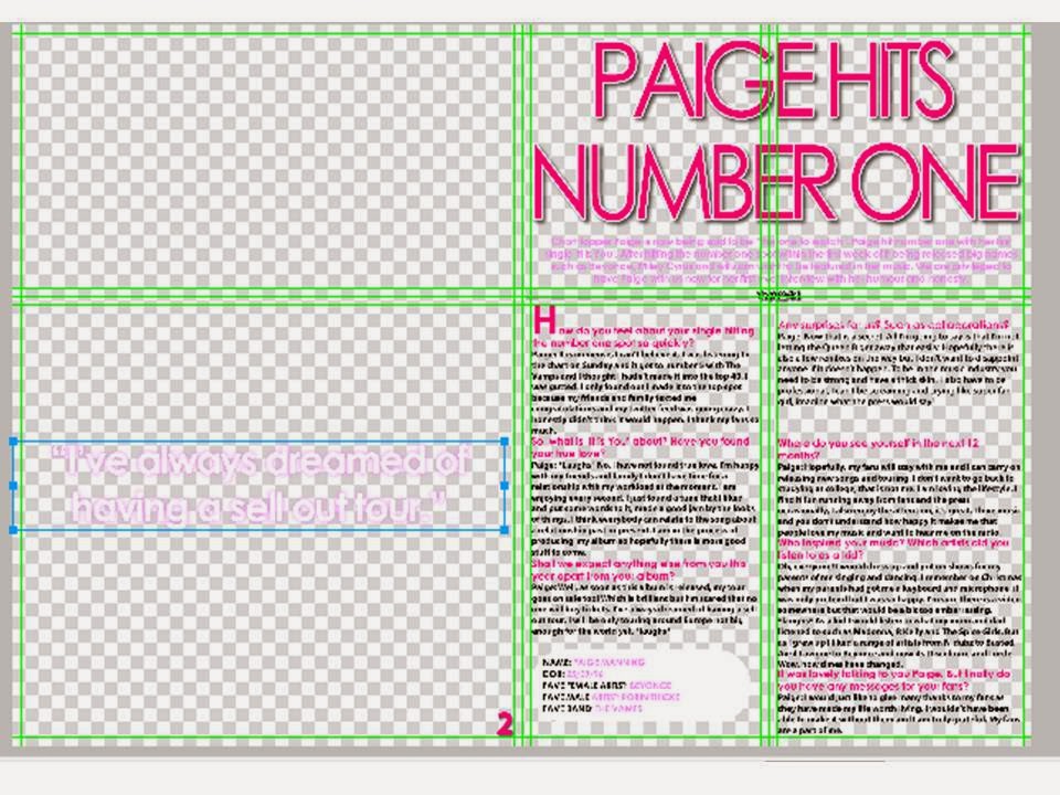
This is my final DPS layout. It contains the magazine masthead and date/issue number along with 'exclusive' making it more professional like a real music magazine. The text fits perfectly in the one column along with a drop cap so the reader knows where to start and an introduction in a different colour. The headline is bold and in the middle of the page making it stand out showing it's importance. I have also included a pull quote which attracts the audience and gives an insight to what the article is about.

Subscribe to:
Posts (Atom)