
Monday, 23 December 2013
Front Cover Draft 2
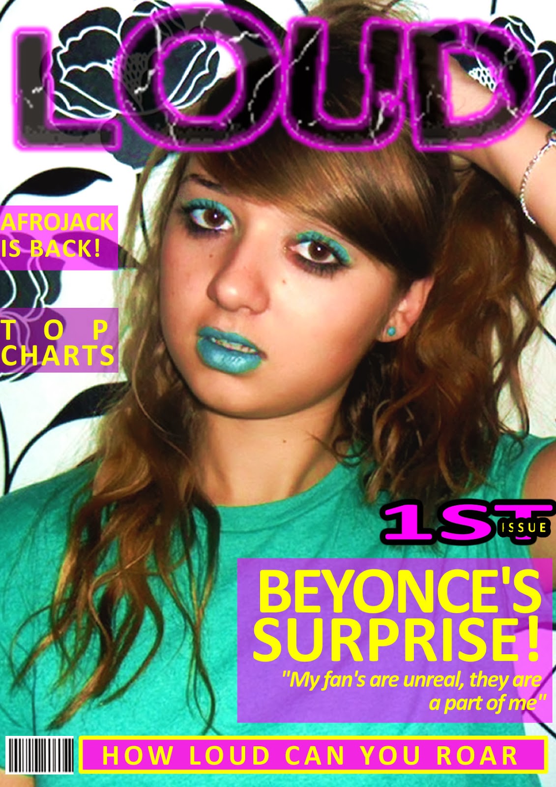
Again I used fireworks for my front cover. The changes I have made due to draft cover 1 is that the image is a mid shot and not a close up therefore the text fit more appropriately on the page. My front cover is still image dominated and the model is still making eye contact therefore engaging the audience. The house style colours have changed due to my masthead but are kept the same throughout and are vibrant, fun and loud. The other thing I have also improved are the cover lines being equally spaced out and rounded giving it a stylish look, some words are also in bold for emphasis which makes my magazine look more professional. I feel that this image is not as dominated as needed to be and the cover lines are all the same with not much emphasis on the artists name which is what attracts the audience.

Friday, 20 December 2013
Front Cover Draft 1
To create my music magazine I am using fireworks. In fireworks you can edit images, add text and pictures create new designs, add effects and be creative which is all very simple. This is my first draft, it is image dominated like my inspiration Dazed and Confused but also has a fair few cover lines to add extra information. The bright colours make it vibrant and fun and suitable for my target audience which are females aged 16-27. The model is directly looking at the camera to engage the audience. The mise-en-scene is planned so everything matches and goes with the house style of bright colours. The cover lines are based on my questionnaire and what artists they voted for. the negatives of this front cover is that there is too many house style colours. The background colours behind the head line and cover lines are squared which does not look professional. Additionally, this photo does not have a price or an issue date. The font which is used does not fit the connotations of being fun, loud and youthful, I feel that it is boring and uninteresting.
Editing Photo's
The second website I have used to edit my photo's is picmonkey.com. This example effect is HDR which makes the intensity either higher or lower making the photo more vibrant. These levels can be changed and varied to how you prefer the photo to look and what effect you want it to give.

Wednesday, 18 December 2013
Draft front cover 1 progress
For my first draft front cover I have chosen pink, yellow and green to be my housestyle as those colours fit with my genre and masthead of 'LOUD'. The image I have chosen is a close up and the subject is making eye contact which engages with the reader. The bold masthead going across the whole page really catches the eye. These images show that I am experimenting and planning where to put the pug, barcode and banner.

Monday, 16 December 2013
Photo Evaluation
Here are a few photos that I feel turned out the best from my first photo shoot. Some of these images have been edited slightly by changing the contrast and brightness or using the black and white effect. I have learnt many things during my first photo shoot such as lighting, quality and the effect costume gives therefore in my next photo shoot I will use a better quality camera and involve more people to hold torches to give a better lighting effect. All these photo's were took in my bedroom so maybe a new surrounding such as outside will show a variety of planning and give an unique effect which fits with my magazine genre being fun, youthful and loud.


Tuesday, 10 December 2013
flickr
On my flikr account there are my photo's I have taken so far, all of which are unedited. Some of these photo's did not go as expected and will be updated gradually with edits and more photo shoots.

Monday, 9 December 2013
Mise-en-scene Moodboard
For my photos I have considered what I want the subject to look like and if there will be any props. The props I have decided are headphones and sunglasses. The headphones give my magazine a more music feel and the sunglasses give a fun youthful look. I have decided a more casual look and also a sophisticated one, these consists of beanies, shirts, dresses and heels.

Editing Tools
One website I have used to edit my photo's is fotoflexer.com
The tools that I am going to use are:

Adjusting and contrast which affect the lighting of my images.

I have used rotating and flipping for when I have duplicated my images.

With my closeups I have used Fix red eye and when cropping objects out of the image that are not the main focus.

I have used these tools when filling or erasing things out. Such as making the background the same colour and drawing in any mistakes.


These helps skin look clear and makes it look like a better quality picture.
Saturday, 7 December 2013
Front Cover
Overall I would like my front cover to be mimilastic as possible. The image will have a plain background with the subject engaging the audience with eye contact. The masthead will be placed in the top left hand corner as this will be the first thing the audience look at, my masthead will also be very recognizable because of it's bright colours. As my front cover is going to be mimilastic there is not going to be much text on the page. I am going to have one main headline which matches one colour of the masthead with very few cover lines accompanying it. My front cover is going to be very colourful and vibrant attracting mostly females from the age range 16-24 who like pop music. The message my front cover is going to portray is happiness and creativity. My magazine will produce powerful feelings along with the strong realistic female dominant images.
Thursday, 5 December 2013
Rule Of Thirds
The rule of thirds is breaking down an image into nine equal parts by two
equally-spaced horizontal lines and two equally-spaced vertical lines.

This now
gives you important guidelines for your photo. The theory is that if your
subject is in the middle of the gridlines then the image will be unbalanced. Therefore
point of interest should be along the
gridlines because research has shown that the eyes do not look straight to the centre
of a picture. Using the Rule of Thirds comes naturally to some photographers.

Wednesday, 4 December 2013
Front Cover Photo Planning Table
This table shows my thoughts and different varieties of how I would like my front cover's image to be like. Each option is different including different costumes, makeup and colour scheme. I have chosen a range as eventually I am going to have to chose which I prefer and which colours and shots give the most effect. All images will have a mimiliastic background helping the subject stand out, this is because I want my audience to be engaged. My photos will be of single people as I feel group photographs make the audience feel less important and disconnected with the artists. I am going to take a range of photos as it will be difficult to find one that fits the layout, colour scheme and masthead perfectly.

Tuesday, 3 December 2013
Mood Board
This is my mood board. My mood board shows what I would like my magazine to contain and what I think my readers should be interested in. I have chosen four artists which consist of Ed Sheeran, Beyonce and Wiz Khalifa and Rihanna. I feel that even though all these artists are in the pop genre, they have different ranges of popularity. I have included YouTube, iTunes, Ministry of Sound and MTV as without these there would be no way of listening to music. Instagram and Twitter and H&M are also types of media which promote artists.

Monday, 2 December 2013
My Inspiration
I would like my music magazine 'LOUD' to be very mimilastic. My inspiration for my music magazine is dazed and confused. This magazine is based in London. Dazed and confused is read in print and online by 500,000 style leaders. It is very influential and successful. Most Dazed and confused front covers are a close up of a subject with creative makeup and costumes. Each magazine consists of a masthead which stands out from everything else. Dazed and confused magaine is mostly focused on fashion therefore does not need as many cover lines. The front cover shows creativity, youth and is unique. The high quality photo's and well organised layout show a professional and successful magazine.

Photoshoot considerations
When planning a photo for my front cover/contents page I need to consider certain things to make sure my photos look professional. These things are:
Makeup
Costumes
Backdrop
Lighting
Props
Hair
Camera Angles and Shots
Body Language
Positioning of subject
Facial expressions
Colours
Representation
single or a group shot
Editing effect
Masthead Ideas
In fireworks I have experimented my different masthead ideas. I have decided from my questionnaire results that I want my music magazine to be called LOUD.


Wednesday, 27 November 2013
Photo Planning for my Front Cover

I want my front cover to be minimalistic as possible, to do this I think I need an image dominated front cover. My image needs to have a plain background and intrigue the audience to have immediate eye contact with the model on the front. I plan on having a close up shot of the face to engage the reader. The subject will be directly looking at the camera with either they're back turned or looking straight forward. I feel that both types of images are engaging but the image with the back turned may be more effective with attracting the reader. My model's are going to be young to attract my target audience as the age range is 16-20 year olds. The subject will be wearing outgoing colourful clothes to fit in with the target audience and the masthead which is LOUD. The background will be plain and simple as I want the focus to be on the subject and not anything else. The lighting is going to be bright to again fit the genre of pop which is classed as being fun. This background can either be inside or outside depending where the suitable backdrop and lighting is.
Front Cover Page Layouts
I have produced a range of layouts for my front cover page, this will help me construct my magazine and help me with how i want my images to fall with the layout.


Saturday, 23 November 2013
Questionnaire Results
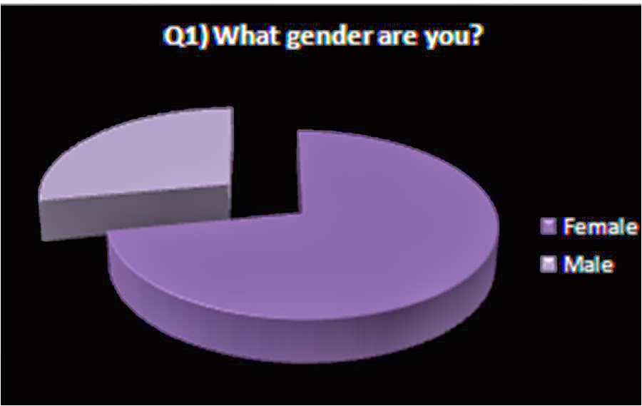
My graph for question 1 shows that most of the people who completed my questionnaire were female. This gives me a more realistic idea of what should be in my magazine and what it should look like. As there is a higher percentage of females this means that my music magazine will be more female related. This is a positive as being a female myself I can also add my own opinion. The disadvantage is that the core audience is not as wide as it could be.

Question 2 shows that most of the people that filled out my questionnaire were 16-20 therefore they shall be my target audience. This helps my music magazine with suitable colours, images and headlines. The ages 20+ only received 4 votes altogether. Again, this is a positive as I am within this age range.

On question 3 the least selected answer was more than twice a week with only 3 people. This shows music magazines are unpopular. 6 people chose once a week but the highest was once a month with 16 people. As most people only buy a magazine once a month I feel that there has to be a fair bit of information so the magazine can last.

For question four the most popular answer was that 12 people would pay £1.00-£1.99 for a music magazine, this is very low. 9 people would pay £2.00-£2.99 and 3 people would pay £3.00-£3.99

Only one person were in Group C1 and C2. Two people were in Class B which are managerial middle class workers. This question shows that 21 people were group E which is students, this is positive as this is also my socio economic group. As Group E was the most chosen then this is my target audience helping me with colours, images, artists and the type of headlines that should be on my music magazine.

The least popular thing in a magazine is competitions with 2 people. Quizes were only chosen by 8 people, this helps as I now know what to put in my music magazine and what would be wasting my time. Interviews received 12 votes and reviews received 11, as there is only one vote separating them, I feel that both should be included in a music magazine as these are important.

Question 7 gives me an insight on what my target audience like to listen to and who they like to look at as and who they like as people. The most popular was Beyonce with 14 votes and the second most popular was Rihanna, this gives me the impression that my target audience like loud and outgoing woman who stand up for what they believe in and having 'girl power'. This again helps images, headlines and colours.

The most favourited male artists are One Direction and Justin Timberlake. These artists have only recently made a comeback meaning my target audience listen to modern music. These two artists are appealing to the eye which again helps me in producing my music magazine with images and headlines.
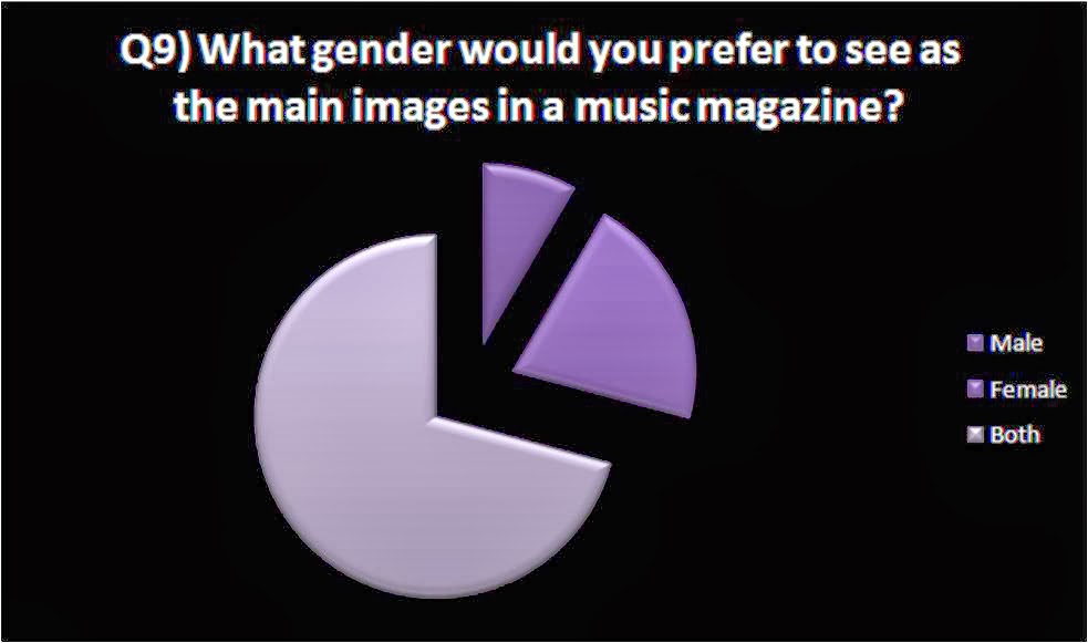
For question 9 only 2 people said that they would like to see just males in the magazine whereas 5 said females but 17 people chose both, this shows that my magazine is unbiased to any gender and is unisex. I feel this helps with my images and layour of my music magazine as I know the target audience doesn't want me to focus on one gender.

This question helps with my music magazine producing the most as these are the things which attract a buyer and persuade them towards a certain magazine. The most popular options were headlines, images and colours. These are now my main focus and I want my music magazine to be popular. As my target audience are femaes ages 16-20 this helps with colours such as pink, yellow and blue. As the headlines are the most important to my target audience then that needs to be well thought through.

This question has helped me in what my music magazine will be called. as the most popular two were LOUD and ROAR. I have chosen LOUD to be my music magazine brand name as it was the most popular and the one that I feel fits the most with my pop genre.

My target audience chose an image dominated page which means they like one main image other than lots of little images therefore my photography needs to be high quality and intriguing towards them making eye contact.

Eye contact was more popular than the artists occupied therefore I know what my music magazine readers want to see so I am going to stick with what they have chosen as i feel this has a more personal feel to the reader.

Neither of these answers recieved more votes, both were the same therefore it is my choice to decide. I feel that a more image dominated spread works better as it feels like you are involved in what the artists is doing.
Monday, 18 November 2013
Questionnaire
What
gender are you?
Female
Male
What
age range do you fit into?
16-20
20-25
25-35
35+
3) How
often do you buy/read a magazine?
Once a week
Once a month
More than twice a week
More than six times a month
4) What
is the price range you are willing to pay for a music magazine?
£1.00-£1.99
£2.00-£2.99
£3.00-£3.99
£4.00+
5)
What
section of the JICNAR scale are you apart of? (please tick)
Group A
(Professionals) Upper middle class, e.g. Barristers,
Doctors, Executives
Group B
(Managerial) Middle class, e.g. Bank Managers, Teachers
Group C1
(Non-Manual) Lower middle class, white collar workers, e.g. Office
Workers
Group C2
(Manual) Skilled working class, Blue collar workers, e.g. Car
Mechanic, Machine operators, Construction workers
Group D
(Partly Skilled) Semi or unskilled manual workers,
e.g. Assembly line worker
Group E
(Unskilled) Casual workers, dependent on state benefits, students
Other (please specify)
6)
What
type of articles are you mostly likely to read? (circle more than one if
needed)
Interviews
Reviews
Quizes
competitions
7) Who
are your favourite female artists? (circle more than one if needed)
Jessie J
Lady GaGa
Rihanna
Katy Perry
Taylor Swift
Miley Cyrus
Beyonce
Ellie Goulding
Other
8) Who
are your favourite male artists? (circle more than one if needed)
One direction
James Arthur
Justin Timberlake
Justin Bieber
Usher
Kayne West
Chris Brown
The Wanted
Other
9) What
gender would you prefer to see as the main images in a music magazine?
Male
Female
Both
10) What
would encourage you the most to buy a magazine?
Colours
Image
Headlines
Brand
Price
Reviews
Articles
Recommendations
Photo quality
Interviews
Question and answer
Facts
Other (please specify)
11) Which brand name do you prefer?
Boom
Loud
Tunes
MU$IK
POP
ROAR
Rhythm
Sound


14) When reading a double page spread do you favour a more image dominated page or a range of smaller images?

Saturday, 16 November 2013
My music magazine brand identities
The brand identities for my magazine is for it to be modern and kept to a minimum so the audience are not too overwhelmed with the information. The front cover will be image dominated depending on my questionnaire results as I want to help the audience feel engaged.
My magazine will be tasteful and be associated with artists already in the music industry, my magazine will have targeting questions such as how to deal with the music industry and what to do. The artists will be passionate and truthful about their music giving a real insight in what it's really like.
Wednesday, 13 November 2013
Q Magazine Band Identity
'Q' follows the same house style with every magazine with the red masthead on the top left of the page and the colours red, black and white being consistent throughout. This makes it recognizable for the audience. This makes the brand identity sophisticated suiting the older audience.
Most of the Q's front covers are closeups, this engages the reader as it seems the famous music artist is making eye contact with them. The close ups of the images and continuity of the masthead shows professionalism and that it is modernized. Q front covers are kept to a minimal only having a few headlines so you can see the image clearly as this is it's main focus.

Most of the Q's front covers are closeups, this engages the reader as it seems the famous music artist is making eye contact with them. The close ups of the images and continuity of the masthead shows professionalism and that it is modernized. Q front covers are kept to a minimal only having a few headlines so you can see the image clearly as this is it's main focus.

NME Magazine Brand Identity
'NME' stands for 'New Music Express'. This magazine mainly focuses on new and upcoming artists. NME magazine front covers convey a lot of information across, this shows thier brand identity is messy and suited towards the younger readers.
The sans-serif font makes the magazine look modern which again suits their target audience which is young people such as 16-26 year olds. NME always have a popular artist on the front cover which always look very serious making the magazine look professional. This appeals to youth as it looks edgy, cool and original which class as the brand values.

The sans-serif font makes the magazine look modern which again suits their target audience which is young people such as 16-26 year olds. NME always have a popular artist on the front cover which always look very serious making the magazine look professional. This appeals to youth as it looks edgy, cool and original which class as the brand values.

Tuesday, 12 November 2013

Monday, 14 October 2013
What I have learnt
Key Media Terms
Media text media text is a specific media product produced by an organisation to a certain audience.
Media form: Type of media a text is using to communicate.
Media Institution: established organisation that produce media products for an audience in advertising, entertainment. Eg. Magazines.
Media Audiences: group of people who receive a certain type of media text
Media representation: how the media portrays messages and meanings bout the world to individual groups.
Media language: how the meaning of text is conveyed to the audience.
Denotation: detailed description of what you see in a picture.
Connotation: what you associate with the picture.
Throughout this process I have learnt various new skills and techniques using fireworks. For example holding shift when re-sizing an image to stop it from looking too fat or squished and unrealistic. I have also learned about photography about what background suits best, the layout of the photo and the lighting.
Planned photo shoot
For my magazine and contents page, I needed appropriate photos. The photos i wanted are Plantsbrook students as it is for the Plantsbrook students and their carers. As I could not take Plantsbrook students out of lessons, I took photo's in my own time with my sister and her friend who attend Plantsbrook school therefore are wearing the uniform. this was done in my back garden, with either a plain brick wall or a fence with a bench as the background so it was not much different to the school surroundings. I also took photos of my fellow media students as we had a lesson to take photos inside the building, I did not feel this looked as effective as we were not in uniform.


Saturday, 12 October 2013
Final Front Cover

I chose this as my final front cover because the people on the front are well dressed in uniform showing that it is Plantsbrook. I have chosen this image because they are both looking at the camera smiling therefore they engage the audience and catch their eye. I have used the housestyle red, white and black throughout as that is the Plantsbrook colors and i feel they stand out. I feel that the red borders emphasis the main text aswell as complimenting the other headlines.
Wednesday, 9 October 2013

Subscribe to:
Comments (Atom)