Friday, 2 May 2014
Question 7 - Looking back at my preliminary task, what do I feel I've learnt in the progression from it?
Paige Manning's Slidely by Slidely Slideshow
http://slide.ly/view/c25f13c6bebfafc836074524a0cc70e5
Comparing my music magazine to my school magazine shows that my skills have improved throughout. This is shown by the quality of my products. When producing my school magazine I had very little knowledge of how much thought and planning goes into the creation which is why the quality is so poor. For my music magazine I researched in to real existing music products which you could buy from shops, this helped a lot. I also did some research into photography aswell as the genre and existing products. While researching into photography I learnt about the ‘Rule Of thirds’ which is about placing the subject/model in the middle of the lens so they are in focus. Creating mock-ups before my final product helped improve my skills so my product could compete against the real ones. The most important thing when producing a magazine is knowing your target audience. So I created a questionnaire which could help me do this so my magazine was suitable towards them. My school magazine was very basic and was not thought through well enough. The photos were of a less quality and included unwanted backgrounds which I could not remove at the time because of my skills. The text is very large and everything is emphasised making it messy and the structure very hard to follow. On the contents the text is far too large and only contains 4 different topics which is very bad quality and is not fit for on the shelves. The images are all different sizes and have not been edited so they look a better quality. My music magazine on the other hand is well developed and in my personal opinion can compete with existing magazine products. I have used the rule of thirds in my photography and edited the brightness and contrast slightly so it looks better quality and the subject stands out. From my research i knew which coverlines to include so it was suitable for my target audience. The important text is more emphasised and there is an organised structure to help my readers. As a whole I feel that I have progressed greatly in each mock-up and final product.
Tuesday, 29 April 2014
Question 6 - What have I learnt about technologies in process of constructing my product?
This is my question 6, I have used empressr which is a online presentation tool.
http://www.empressr.com/View.aspx?token=AdJ4%2fzSs4wI%3d
Monday, 14 April 2014


Evaluation Question 4 - Who would be the audience for your magazine product?
My magazine is aimed at young females aged between 16 and 20 which are within the socio-economic group E (students). The subject in my magazine is wearing basic clothes such as white t-shirt and vests therefore my audience will tend to shop on the high street at shops such as Primark and New Look. Students tend to live either at home with families or they go to uni and live in a flat. To socialise students usually go to the park in the summer or to the cinema in the winter. Students tend to spend all their money on clothes, food and essential needs. In free time students spend most of their time on social networking sites, this is a benefit as it helps with advertising. Most people own smartrphones such as iPhones and Android phones which are capable of having APPS which is what I aim for my target audience to use. Youtube is very popular with students along with music channels on TV and iTunes. I would also have a secondary audience of younger and older siblings as well as parents, cousins and friends that will also read and look at the magazine but they will not be my core audience because they are not personally suited towards it. Hopefully my magazine will be spoke about because of the content that is in so more and more people would like to buy my magazine giving it a wider audience.
Wednesday, 2 April 2014
Monday, 31 March 2014
Friday, 21 March 2014
Evaluation Question 1 - In what ways does your media product use, develop or challenge the forms and conventions of real media products?
Question One on my evaluation has been produced on PADLET - http://padlet.com/2509paige1/evaulationQ1

Tuesday, 18 March 2014


Sunday, 16 March 2014
DPS ideas
The layout of my DPS has changed because of the imagery. When adding the image I have had to move the text around so you can see the subject clearly.


Monday, 10 March 2014
Experimenting with DPS layout
For my second layout I changed the font size to 16 which looked better but is still larger than normal. This makes the text fit perfectly in the one column. The fact file looks better as I have centered the text and put it at the beginning for background information. This layout also contains the masthead of the magazine so it is recognizable.

This is my final DPS layout. It contains the magazine masthead and date/issue number along with 'exclusive' making it more professional like a real music magazine. The text fits perfectly in the one column along with a drop cap so the reader knows where to start and an introduction in a different colour. The headline is bold and in the middle of the page making it stand out showing it's importance. I have also included a pull quote which attracts the audience and gives an insight to what the article is about.

Monday, 17 February 2014

DPS ANALYSIS

A plain white background used to make the photo(even the faded parts) and the text stands out on the page because the black text contrasts against the white background.The photo has been edited so that the main artist in the band stands out and the other three have been faded into the back ground. The title also follows the house style colours of the costume which runs throughout the DPS. Most of the text is black on white although quotes have more emphasis. The image has the most emphasis as this is what the audience are most attracted to.
Code and Conventions of DPS
There are many codes and conventions for a successful DPS such as:
Text
Main Image
Smaller Images
Pull Quotes
Headline
Sub headline/info
Good quality images
Correct English and grammar
Following house style
May include the matshead
Colour
Emphasis
Quotes
Page Furniture:
Pull quote
Cross head
Opinion Box
Box Out
Folio / Slug
Reader interaction
Info bar
Caption/caption header
By line
Drop Cap
Header sell / strap


Sunday, 16 February 2014
Front Cover

Monday, 10 February 2014


Thursday, 30 January 2014


Monday, 27 January 2014
Example Contents Page

Conventions of a contents page:
- structured/organised layout
- subscriptions
- font emphasis (eg. italic, bold, colour)
- columns (2/3)
- Editors letter
- Page numbers
- 'Contents' or 'inside' as heading
- images
- titles, blurbs, captions
- headlines
- house style
These a good example contents pages because they each follow their house style from the front cover such as 'Q' with the red. Each separate image has a page number and blurbs which associates with the picture engaging the audience so they know what is inside. Each layout is organised with all the text in the same place along with emphasis of colour, boldness and capitals and not being dotted around giving a bad visual syntax. The page numbers are also important so they need to be larger and emphasized.
Thursday, 23 January 2014
Front Cover
 For this front cover I have experimented and changed the layout of my context. the masthead has stayed in the same place throughout as it is the first thing you look at. I have kept it the same size throughout as it needs to be seen and the connotations of the magazine being called 'LOUD' is fun, young and vibrant which is also the reason why I have chosen the house style colours to be black, white and hot pink.
The pug fits at the top of the page below the masthead and on the right as this also needs to be seen as the '1st issue' is relevant to the magazine. The pug does not look correct underneath the cover lines and next to the main headline. The '1st issue' stands out as the font is a different style and is also white rather than pink. the pink stroke with the black background also makes it stand out as they are contrasting colours.
The main headline needs to be bold as it is the most important thing inside the magazine. Therefore I have used capital letters and a stroke for emphasis. I have changed the headline from 'PAIGE HITS #1' to 'PAIGE' and added a tag line underneath so 'PAIGE' can be larger to stand out as she is a new object. I have moved the head line around the page from the middle to bottom, this is because I had to fit the cover lines in where there was space.
The cover lines I have reduced from three to two, made them smaller and experimented the layout. The artists names are larger and in a bolder font than the tag lines, this is because they are most important and need more emphasis because it is who the audience want to read about. the cover lines have a faint white background because without it the audience wont be able to read the text because of the black and white background. the cover lines being at the bottom of the page is unique but I feel that the visual syntax is not very appealing.
The subject of the image makes eye contact and is facing the camera which attracts the audience and intrigues them to buy the magazine. The house style of pink, black and white also stands out as they are bright colours and attract the eye because it is different from the classy red of other magazines. The plus sign is bright pink and emphasised by the black glow around it this shows there is more to expect in the magazine. The barcode, release date and the prcie need to be altogether as they associate with each other and would not make sense if they were different corners of the page, these are small as they are not ov
Monday, 20 January 2014
Double Page Spread Article
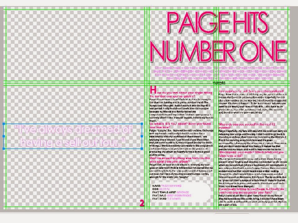
Chart topper Paige is now being said to be
“the one to watch”. Paige hit number one with her first single ‘It is You’.
After hitting the number one spot within the first week of it being released
big names such as Beyonce, Miley Cyrus and will.i.am want to be featured in her
music. We are privileged to have Paige with us now for her first ever interview
with her humour and honesty.
How
do you feel about your single hitting the number one spot so quickly?
Paige: It is immense, I can’t believe it. I was listening to the chart on Sunday and it got to number 5 with The Vamps and I thought I hadn't made it into the top 40. I was gutted. I only found out I made it to the top spot because my friends and family texted me congratulations and my twitter feed was going crazy. I honestly didn't think it would happen. I thank my fans so much.
Paige: It is immense, I can’t believe it. I was listening to the chart on Sunday and it got to number 5 with The Vamps and I thought I hadn't made it into the top 40. I was gutted. I only found out I made it to the top spot because my friends and family texted me congratulations and my twitter feed was going crazy. I honestly didn't think it would happen. I thank my fans so much.
So,
what is ‘It is You’ about? Have you found your true love?
Paige: *Laughs* No, I have not found true love. I’m happy with my friends and family I don’t have time for a relationship with my workload at the moment, I am enjoying every second. I just found a tune that I liked and put some words to it, made a good jam by the looks of things. I think everybody can relate to the song about a relationship past or present. I am in the process of producing my album so hopefully there is more good stuff to come.
Paige: *Laughs* No, I have not found true love. I’m happy with my friends and family I don’t have time for a relationship with my workload at the moment, I am enjoying every second. I just found a tune that I liked and put some words to it, made a good jam by the looks of things. I think everybody can relate to the song about a relationship past or present. I am in the process of producing my album so hopefully there is more good stuff to come.
Shall
we expect anything else from you this year apart from your album?
Paige: Well, as soon as this album is released, my tour goes on sale too! Which is brilliant but I’m scared that no one will buy tickets. I’ve always dreamed of having a sell out tour. I will be only touring around Europe not big enough for the world yet. *laughs*
Paige: Well, as soon as this album is released, my tour goes on sale too! Which is brilliant but I’m scared that no one will buy tickets. I’ve always dreamed of having a sell out tour. I will be only touring around Europe not big enough for the world yet. *laughs*
"I've always dreamed of having a sell out tour"
Any
surprises for us? Such as collaborations?
Paige: Now that is a secret. All I’m going to say is that I’m not letting the Queen B get away that easily. Hopefully there is also a few remixes on the way but I don’t want to disappoint anyone if it doesn’t happen. To be in the music industry you need to be strong and have a thick skin. I also have to be professional, I can’t be screaming and crying like super fan girl, imagine what the press would say!
Paige: Now that is a secret. All I’m going to say is that I’m not letting the Queen B get away that easily. Hopefully there is also a few remixes on the way but I don’t want to disappoint anyone if it doesn’t happen. To be in the music industry you need to be strong and have a thick skin. I also have to be professional, I can’t be screaming and crying like super fan girl, imagine what the press would say!
Where
do you see yourself in the next 12 months?
Paige: Hopefully, my fans will stay with me and I can carry on releasing new songs and touring. I don’t want to go back to studying at college, that is not me. I am loving the lifestyle. I find it fun running away from fans and the press occasionally, I also enjoy the attention, it’s great. I love music and you don’t understand how happy it makes me that people love my music and want to hear me on the radio.
Paige: Hopefully, my fans will stay with me and I can carry on releasing new songs and touring. I don’t want to go back to studying at college, that is not me. I am loving the lifestyle. I find it fun running away from fans and the press occasionally, I also enjoy the attention, it’s great. I love music and you don’t understand how happy it makes me that people love my music and want to hear me on the radio.
"I enjoy the attention"
Who
inspired your music? Which artists did you listen to as a kid?
Oh, everyone! I would dress up and put on shows for my parents of me singing and dancing. I remember on Christmas when my parents had got me a keyboard and microphone, it was only pretend but I was so happy. I’m sure there is a video somewhere but that would be a bit too embarrassing. *laughs* As a kid I would listen to what my mom and dad listened to such as Madonna, R Kelly and The Spice Girls. But as I grew up I liked a range of artists from N-dubz to Busted, Avril Lavigne to Beyonce and now its Discoloure and Lorde. Wow, how times have changed.
Oh, everyone! I would dress up and put on shows for my parents of me singing and dancing. I remember on Christmas when my parents had got me a keyboard and microphone, it was only pretend but I was so happy. I’m sure there is a video somewhere but that would be a bit too embarrassing. *laughs* As a kid I would listen to what my mom and dad listened to such as Madonna, R Kelly and The Spice Girls. But as I grew up I liked a range of artists from N-dubz to Busted, Avril Lavigne to Beyonce and now its Discoloure and Lorde. Wow, how times have changed.
It
was lovely talking to you Paige. But finally do you have any messages for your
fans?
Paige: I would just like to give many thanks to my fans as they have made my life worth living. I wouldn't have been able to make it without them and I am truly grateful. My fans are a part of me.
Paige: I would just like to give many thanks to my fans as they have made my life worth living. I wouldn't have been able to make it without them and I am truly grateful. My fans are a part of me.
"My fans are apart of me"
Saturday, 18 January 2014
Draft Front cover 5
This is number 5 of my draft front covers, for this cover I have used a more basic and neutral colour scheme on this front cover as my other ones I felt were too colourful and bright making it look cheap and tacky. as this front cover is basic i feel that it is still eye catching because of the image being big large and making eye contact. the masthead is in different print making it stand out. there is a barcode, release date and price placed in the corner of the page away from anything else so it can be seen clearly because this is what the audience is attracted to. The main headline is bold and includes a tag line so the audience know what will be inside. I have developed the cover lines so that the artists name is more emphasis and larger to attract the audience to what is inside the magazine. I have only emphasised the artists names as they are the most important and people only care about this and not what it is about. The pug also stands out as it is large and a different colour compared to the main text but the colour is still within the colour schemes as it matches the lipstick from the subject. I feel the negatives of this front cover is that there is a lot of empty space and could do with a few more cover lines. I also feel the image is too basic and the costume and make up does not represent a music artists.

Friday, 17 January 2014
Draft Front Cover 4
This is my draft front cover number 4, I have produced this is fireworks. the image is very dominated as the subject is looking at the camera and making eye contact with the audience. My house style is pink and black which matches the masthead. As my magazine is called 'LOUD' I feel that the house style fits well as the connotations are young, vibrant and fun. The music artists in the cover lines are emphasised as these things are most important and what attracts my audience.

My target audience evaluated my front cover and gave me feedback. The artists names in the cover lines could be larger and more emphasised. As some text does not need to be emphasised I have overused the strokes around the text when it is not needed therefore the important names such as the music artists do not stand out as much as they should.

In this front cover I have improved the cover lines and took on board the negatives from what my target audience have said. I have made the artists name's larger therefore they stand out more which attracts my audience as well as a stroke to emphasise. I have used a spacer in between each cover line to make it look more professional and so my audience do not get mixed up with each cover line. Another negative that was pointed out was that my main head line looks childish and the type that would be on a comic magazine.

I have rotated the price and barcode so there was space to add an issue date to make it look more professional and stylish. I have also changed my head line font to make it more classy and fits with the genre of pop and connotations of loud, young and fun.
Wednesday, 15 January 2014
Draft Front Cover 3
This is my third draft front cover, this is made on fireworks. In this draft I have used a different housetyle and name, this housestyle 'BOOM' with the bright colours gives the impression that my magazine is young and vibrant. the boldness of the artists name on the subheadings show importance and authority. Throughout my front cover I have used the same colours which is following my house style. the main headline is in bold text and bright colours attracting the audience. the image is very dominant as the subject is making eye contact and is in front of the mast head.

Subscribe to:
Posts (Atom)